Toronto Environmental Alliance
For over 30 years, Toronto Environmental Alliance has campaigned locally to find solutions for Toronto’s urban environment problems. Donors and users were confused with the website’s purpose and had difficulty locating information on local programs. How might we make the website responsive to different devices and drive attention to the main call-to-action which is to increase donation?
Role: worked with Natasha and Summayya on this project. We shared the work equally and each took on the role of UX Researcher, UX Designer and UI Designer.


The Process


Empathize
Define
Ideate
Prototype
Test
Opportunities
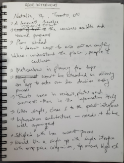
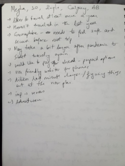
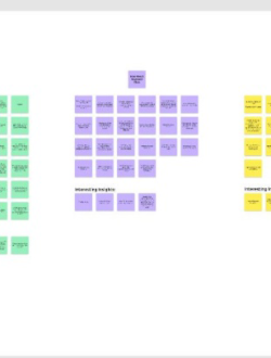
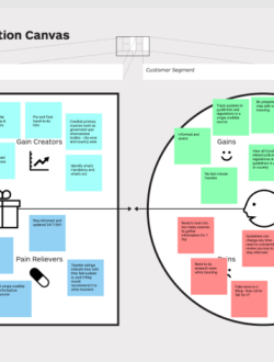
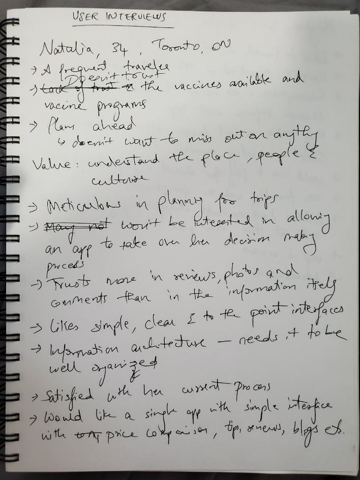
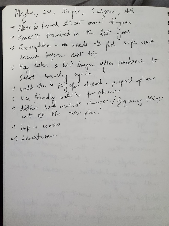
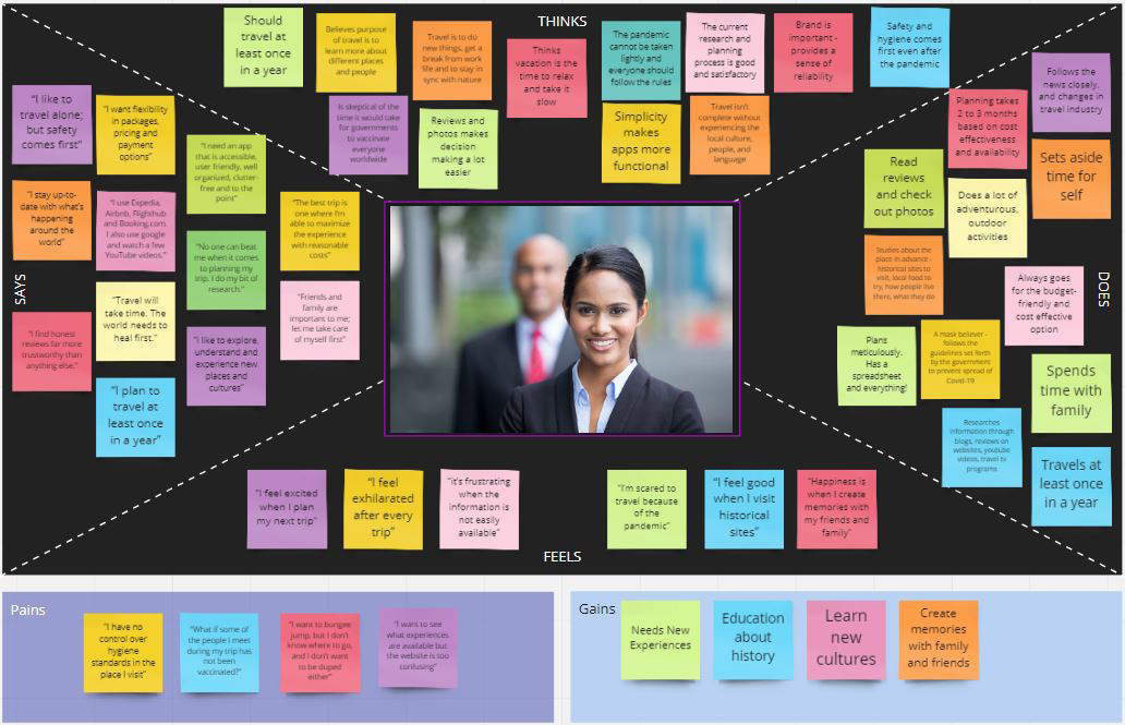
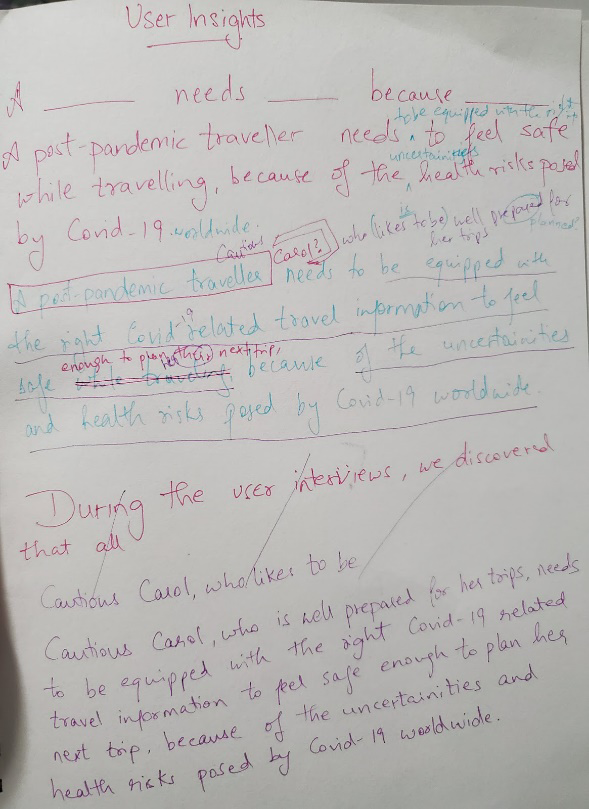
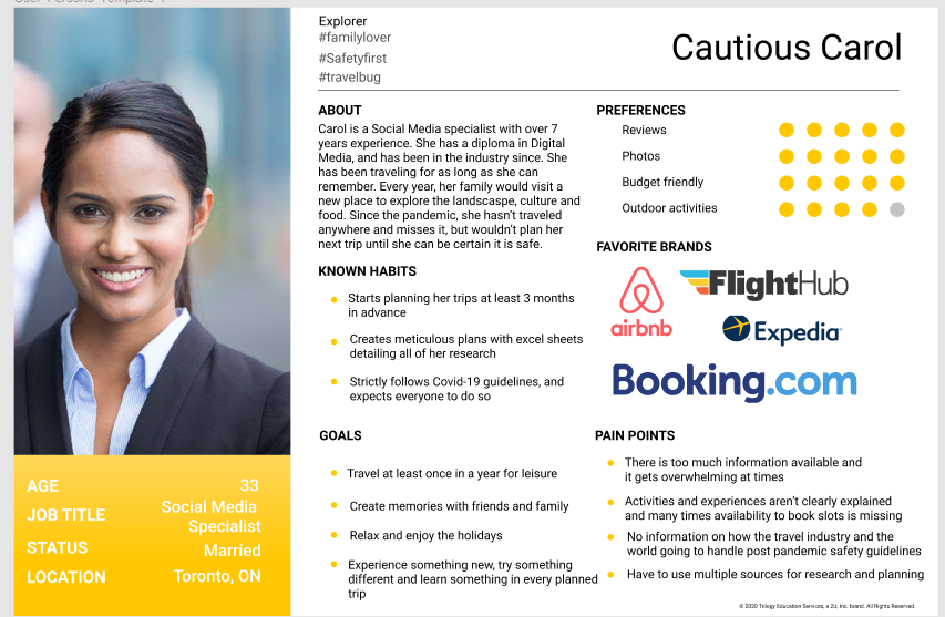
Built the proto persona before diving into qualitative user interviews. Consolidated the data from user interviews with the help of the [popup_anything id=”416″] and [popup_anything id=”418″] to curate the user persona, Green Gabriella, who is an environment conscious Toronto resident who wants to see an impact in her immediate environment.
We also did an extensive user survey to better understand the behavior and needs of our user, and found that over 58% of the respondents were involved in Environmental issues and 100% of them wanted resources and guides on ways to recycle. While 91% of the respondents recycle regularly, only 41% monitors their waste production.
In addition to this, we also completed a [popup_anything id=”420″] by interviewing our stakeholder – employees of TEA. We understood that the website has not been updated since 2015, and that their main goal is to get users to engage more by donating and reading articles and blogs on the website. [popup_anything id=”642″]
Toronto Environment Alliance can expand the reach of their programs to all of Ontario. Additionally, they have an opportunity to create an app that tracks your carbon footprint which would further add value to the programs they already offer.
We conducted two types of user tests: 5 second test to test the effectiveness of Call to Action, and A/B testing to determine the most optimal footer and header.
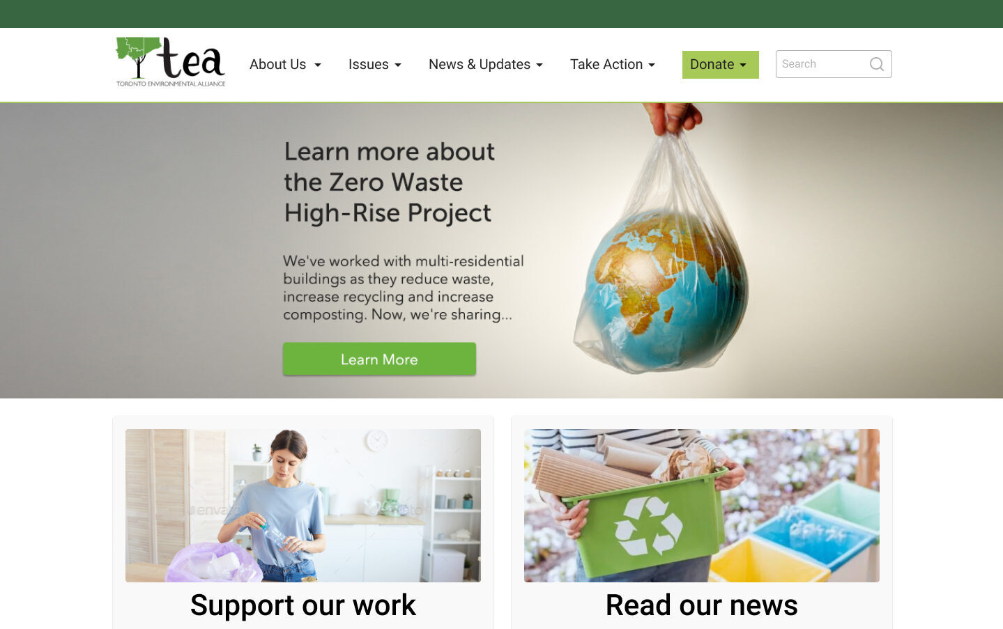
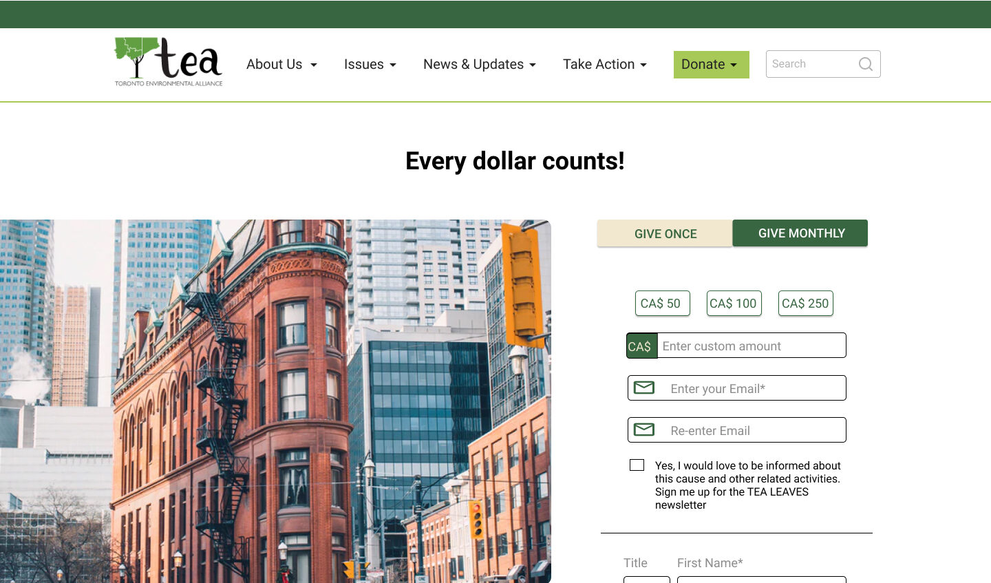
Our Usability test focussed on finding out if users were able to identify the main Call-to-Action – to Donate. We found that users were able to access the ‘Make a Donation’ page, subscribe to Tea’s newsletter and read articles.
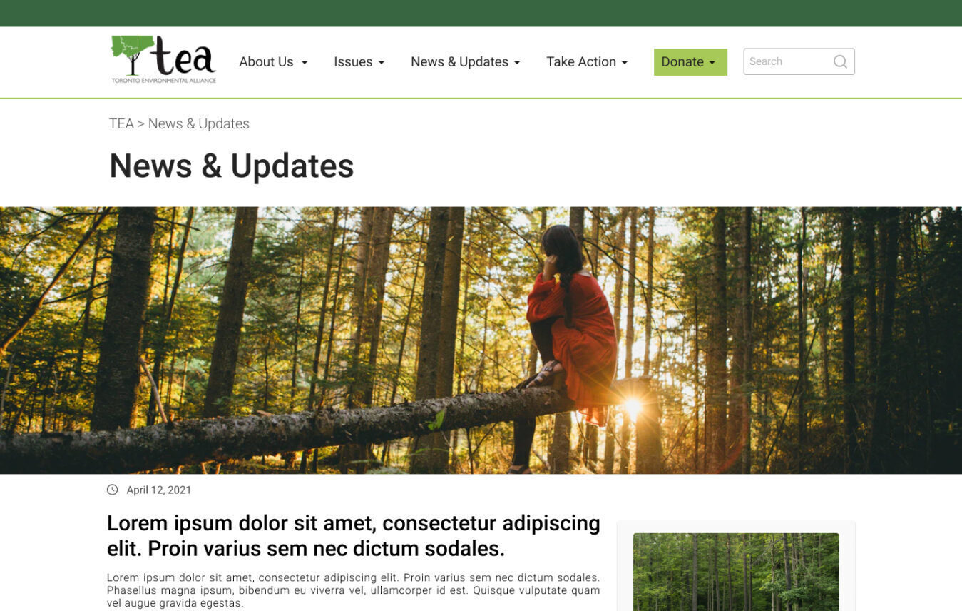
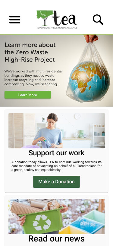
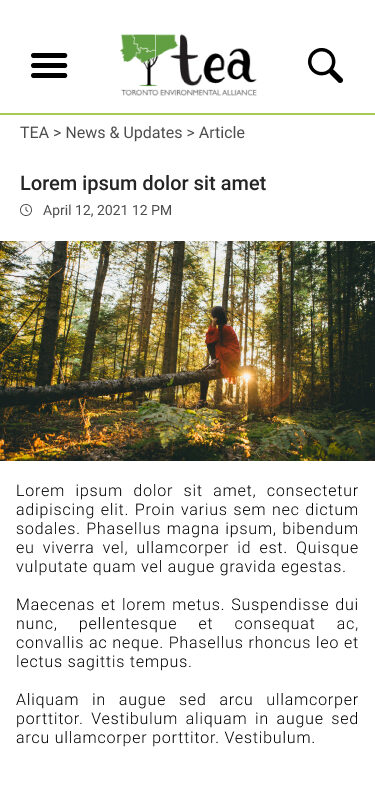
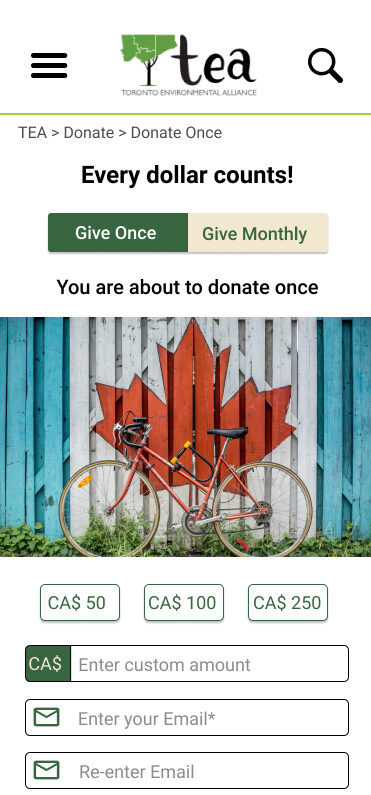
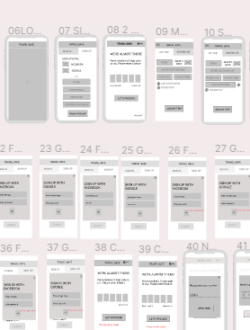
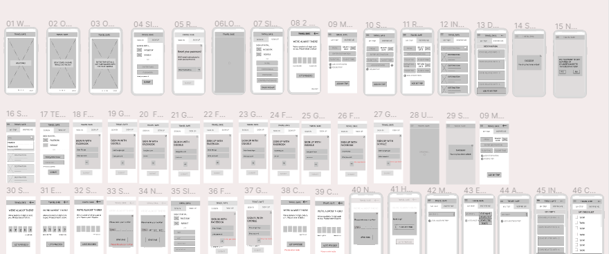
We built a [popup_anything id=”422″]with no images and clean layout. Based on the user research conducted and the heuristic evaluation, we decided to focus on a layout that supported more images and minimal text for easy retention and maximum impact. We also kept all Call-to-Actions as direct and clean as possible.
After creating a [popup_anything id=”425″], we built the [popup_anything id=”428″] with accessible colors, typography and iconography for a consistent brand outlook. We added red to the color palette so it can compliment green and also act as a visual indicator to highlight error messages when users are interacting with the interface.
After consolidating user testing on the mid fidelity prototype, we built the [popup_anything id=”433″] with the support of the UI Style Tile.
We conducted a detailed [popup_anything id=”436″] and determined that there was inconsistent use of white space and inconsistent color palette throughout the website. Additionally, some images appeared out of context and the articles were text heavy. It was also found that the logo could be more optimally placed and the inconsistent layout could have more order.
We also did a [popup_anything id=”434″] and found that websites like Environmental defence, Green Peace Canada, Ontario Nature and Peta had clear communication on cause and CTA, simple and easy-to-understand terminology, clear and concise Information Architecture, and consistent layout and branding.
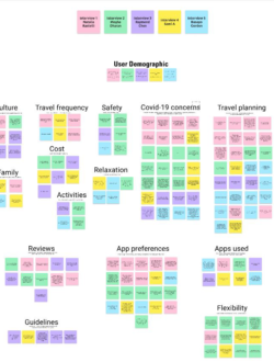
Additionally, we conducted [popup_anything id=”438″] as a way to reorganize and simplify the information on the website. During this process, we found some crucial information was buried under a series of links and hard to access.
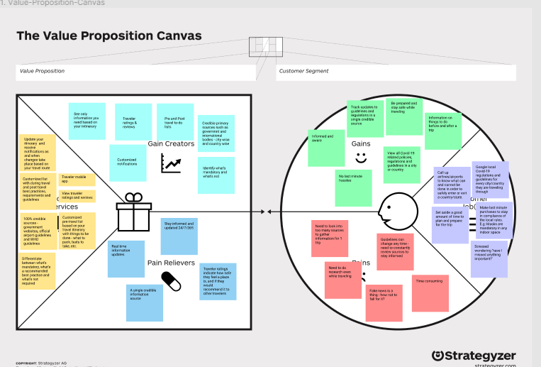
With this information, we created a [popup_anything id=”441″] and determined the [popup_anything id=”443″] of the responsive website.
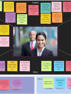
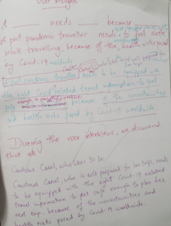
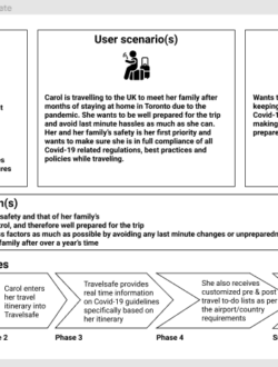
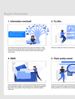
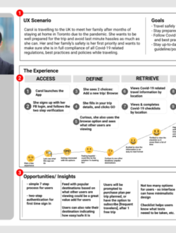
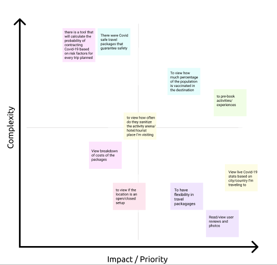
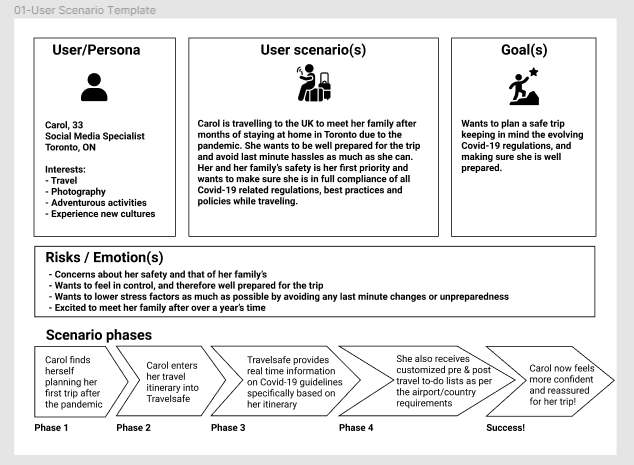
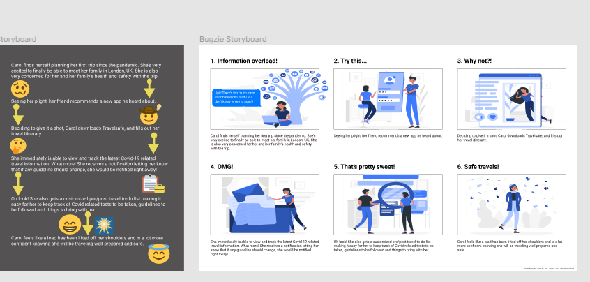
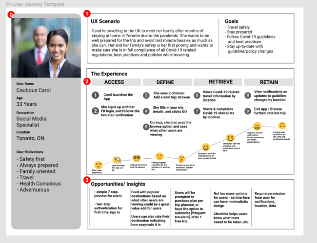
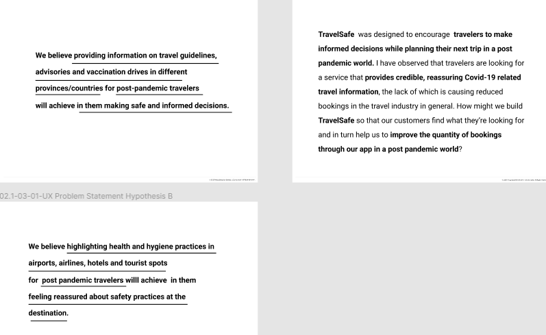
Furthermore, created [popup_anything id=”215″] that helped [popup_anything id=”225″] the user’s potential journey. This led to the creation of the [popup_anything id=”227″] for the TravelSafe app.
With research collected through user interviews, user survey and stakeholder interviews, we brainstormed ideas through the [popup_anything id=”445″] and Feature Prioritization methodology. We were able to narrow down the crucial problem users of the Toronto Environment Alliance website faced – clear Call-to-Action and better usability.
We believe that the TEA website was designed to help users based out of Toronto take action for a greener city by participating in their programs, donating and through legacy gifts. We observed that the website is not clear on their purpose, actions and projects, and is inconsistent with branding. How might we improve the usability and brand recognition of the website so that our users are able to identify with the cause and actions of the organization leading to higher donations?
The Process
Empathize
Built the proto persona before diving into qualitative user interviews. Consolidated the data from user interviews with the help of the Affinity diagram and Empathy maps to curate the user persona, Green Gabriella, who is an environment conscious Toronto resident who wants to see an impact in her immediate environment.
We also did an extensive user survey to better understand the behavior and needs of our user, and found that over 58% of the respondents were involved in Environmental issues and 100% of them wanted resources and guides on ways to recycle. While 91% of the respondents recycle regularly, only 41% monitors their waste production.
In addition to this, we also completed a stakeholder analysis by interviewing our stakeholder – employees of TEA. We understood that the website has not been updated since 2015, and that their main goal is to get users to engage more by donating and reading articles and blogs on the website.
Define
With research collected through user interviews, user survey and stakeholder interviews, we brainstormed ideas through the I like, I wish and I want and Feature Prioritization methodology. We were able to narrow down the crucial problem users of the Toronto Environment Alliance website faced – clear Call-to-Action and better usability.
We believe that the TEA website was designed to help users based out of Toronto take action for a greener city by participating in their programs, donating and through legacy gifts. We observed that the website is not clear on their purpose, actions and projects, and is inconsistent with branding. How might we improve the usability and brand recognition of the website so that our users are able to identify with the cause and actions of the organization leading to higher donations?
Idate
We conducted a detailed Heuristic Evaluation and determined that there was inconsistent use of white space and inconsistent color palette throughout the website. Additionally, some images appeared out of context and the articles were text heavy. It was also found that the logo could be more optimally placed and the inconsistent layout could have more order.
We also did a competitor analysis and found that websites like Environmental defence, Green Peace Canada, Ontario Nature and Peta had clear communication on cause and CTA, simple and easy-to-understand terminology, clear and concise Information Architecture, and consistent layout and branding.
Additionally, we conducted Card Sorting as a way to reorganize and simplify the information on the website. During this process, we found some crucial information was buried under a series of links and hard to access.
With this information, we created a User Journey Map and determined the User Flow of the responsive website.
Prototype
We built a mid fidelity prototype with no images and clean layout. Based on the user research conducted and the heuristic evaluation, we decided to focus on a layout that supported more images and minimal text for easy retention and maximum impact. We also kept all Call-to-Actions as direct and clean as possible.
After creating a mood board , we built the UI Style Tile with accessible colors, typography and iconography for a consistent brand outlook. We added red to the color palette so it can compliment green and also act as a visual indicator to highlight error messages when users are interacting with the interface.
After consolidating user testing on the mid fidelity prototype, we built the high-fidelity mobile and desktop prototype with the support of the UI Style Tile.
Test
We conducted two types of user tests: 5 second test to test the effectiveness of Call to Action, and A/B testing to determine the most optimal footer and header.
Our Usability test focussed on finding out if users were able to identify the main Call-to-Action – to Donate. We found that users were able to access the ‘Make a Donation’ page, subscribe to Tea’s newsletter and read articles.
Opportunities
Toronto Environment Alliance can expand the reach of their programs to all of Ontario. Additionally, they have an opportunity to create an app that tracks your carbon footprint which would further add value to the programs they already offer.
ZOOM
ZOOM
ZOOM
ZOOM
ZOOM
ZOOM
ZOOM
ZOOM
ZOOM
ZOOM

ZOOM
ZOOM
ZOOM
ZOOM
ZOOM
Keep In Touch!
[wpforms id=”383″]
